Genesis concept art
May 7, 2022
Some concept art for Cosmic Void: Genesis
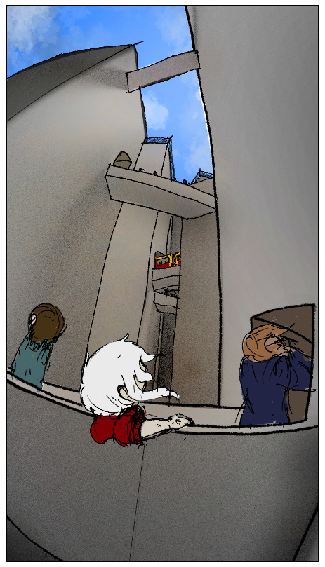
The idea with Cape Namida is that it's a very dense city, with very little horizontal space, so it is built very vertically. Because of this, going from building to building can take a very long time if you have to go down to street-level every time, so bridges are built between the buildings to minimize the need for long elevators.
I feel like something like this would require a lot of safety nets, but that sounds like a big maintenance cost, so I'm thinking most bridges are probably enclosed, actually.
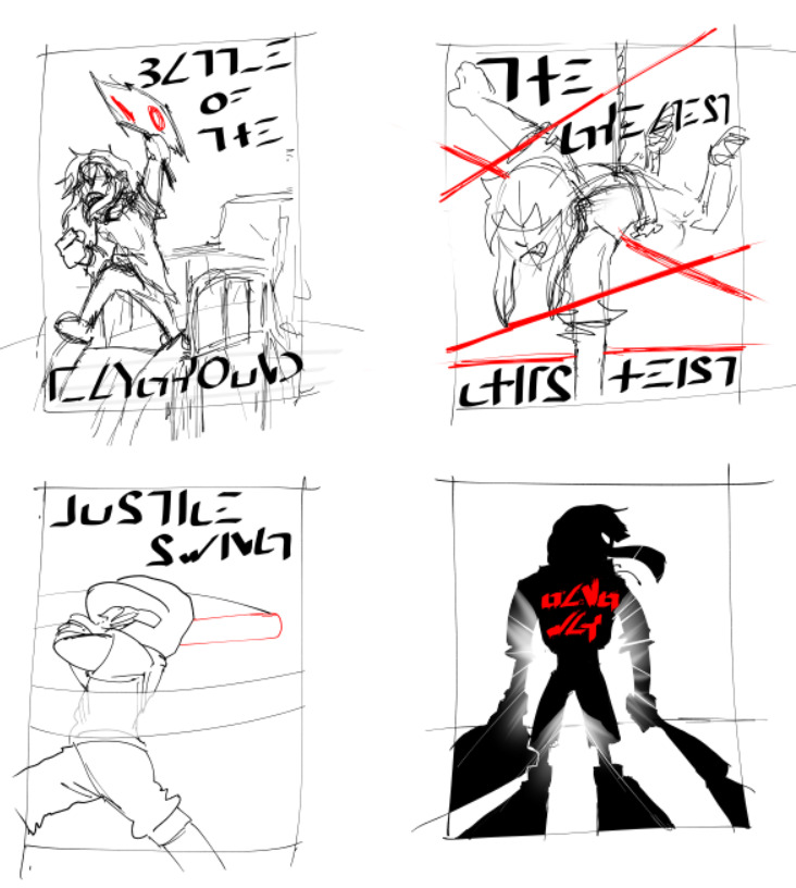
Genesis will have 5 chapters, one for each school year. I want the first 2 to be very light-hearted, to build up the characters, then gradually make them grow through increasingly high-stakes events in the next 3 chapters.
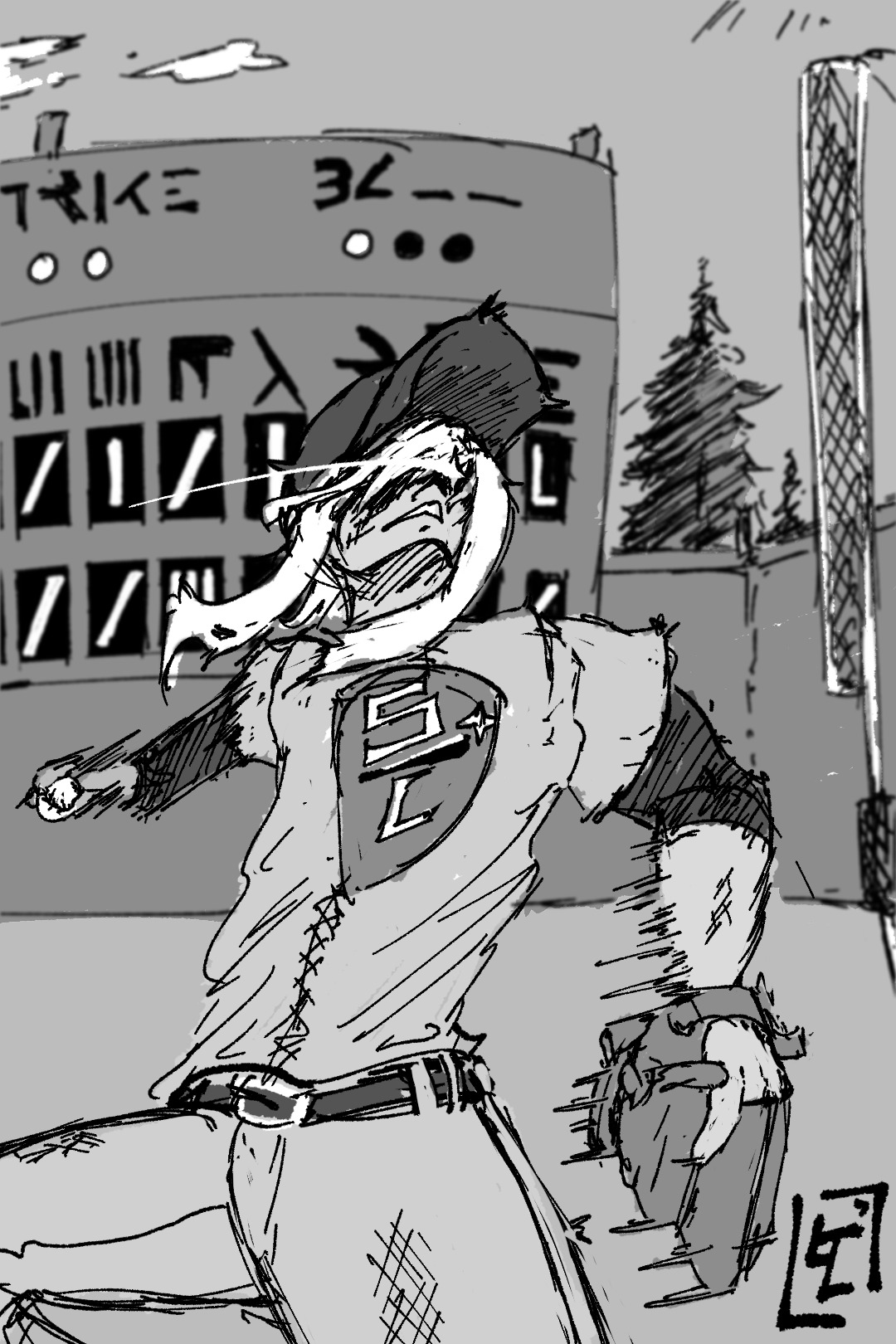
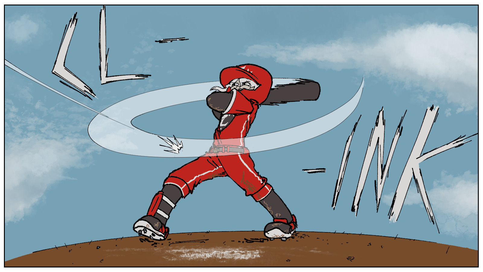
When I started writing Genesis, I didn't expect baseball to even be a thing at all, and now it is a very important part of the story. It certainly didn't help that as the idea grew on me, I looked up baseball representations in other medias and ended up binging all of the Big Windup! manga. That really cemented it for me, like a "oh yeah, this is exactly what I want to add to this story" kind of way.
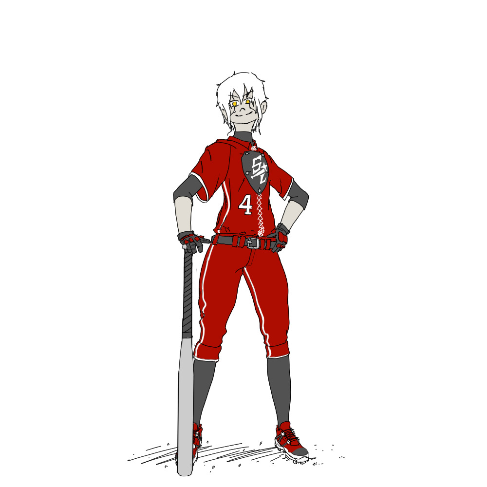
I had a lot of fun designing the uniform, too! I wanted something slightly modern, but with a retro aesthetic, to match the world of Genesis. In the end I used the shield design from the late 1800s, so maybe I went a bit overboard with it... But I guess it fits with some of the anachronistic details of the story, so I'll pretend this was on purpose.
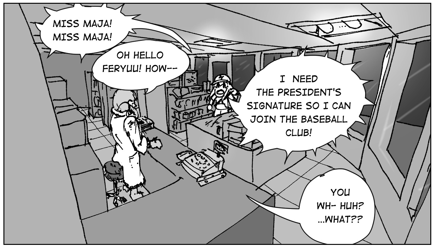
Ahhh, Conima. This place will come up a lot in the story, as this is the workplace for Maja's side job (she's the kids homeroom teacher during most days). Her appartment is also located just above the store. Because of the close relationship between her and the kids, they end up frequenting this store a lot.
It's a very typical franchised corner store; part of it is inspired from japanese konbinis, but really it's more of a small grocery store, like a Vidal. Well, I guess nowadays there is very little difference between the two anymore.
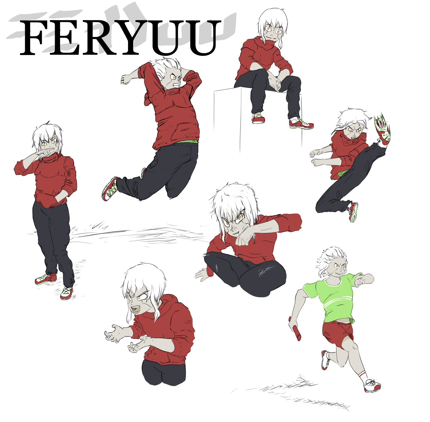
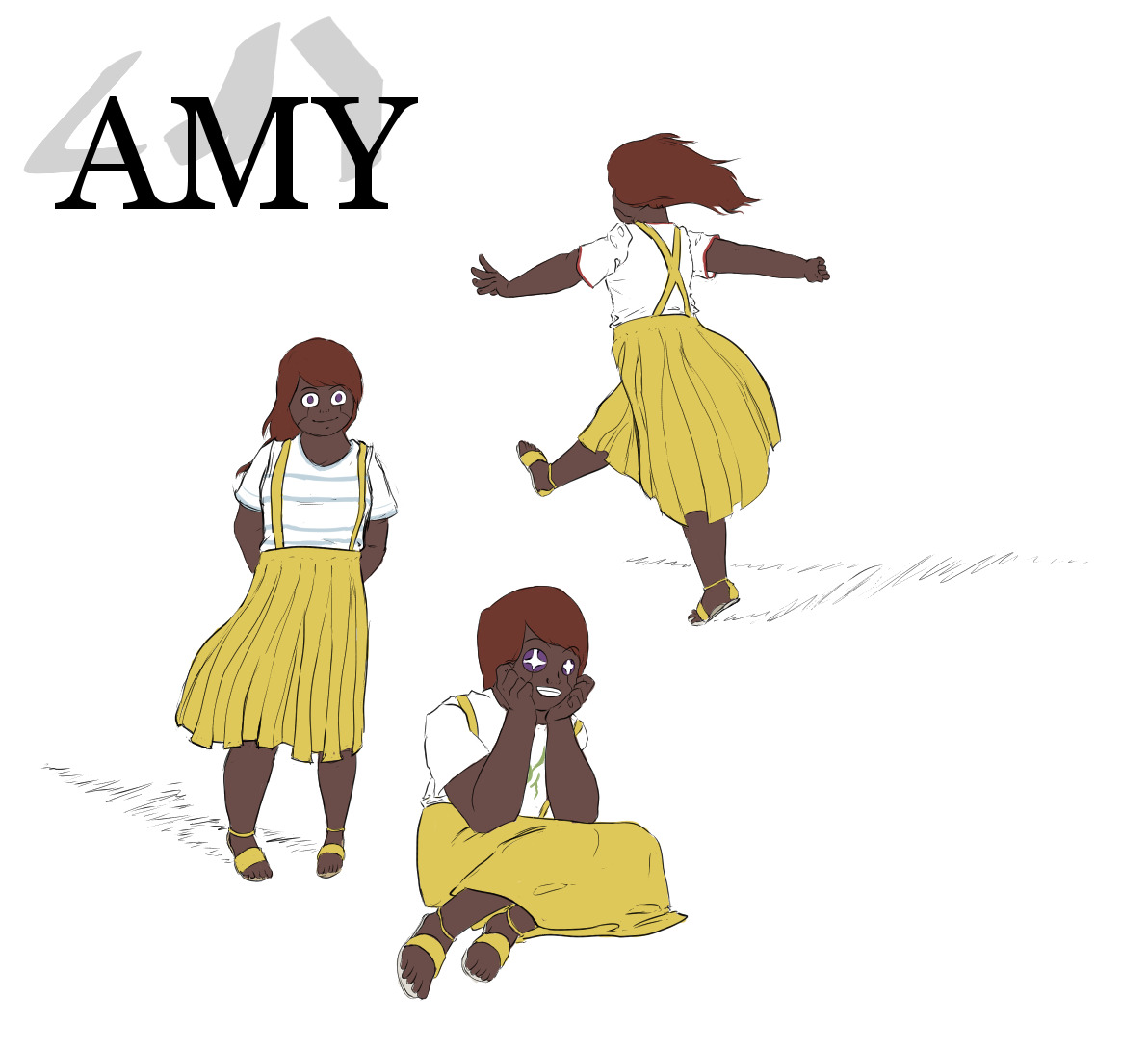
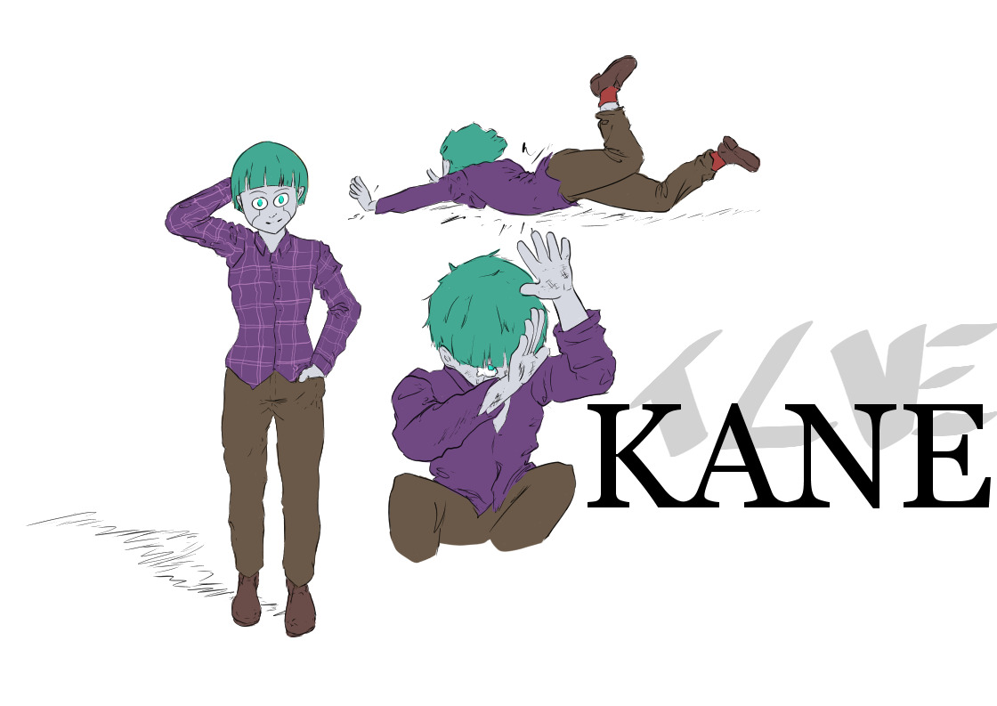
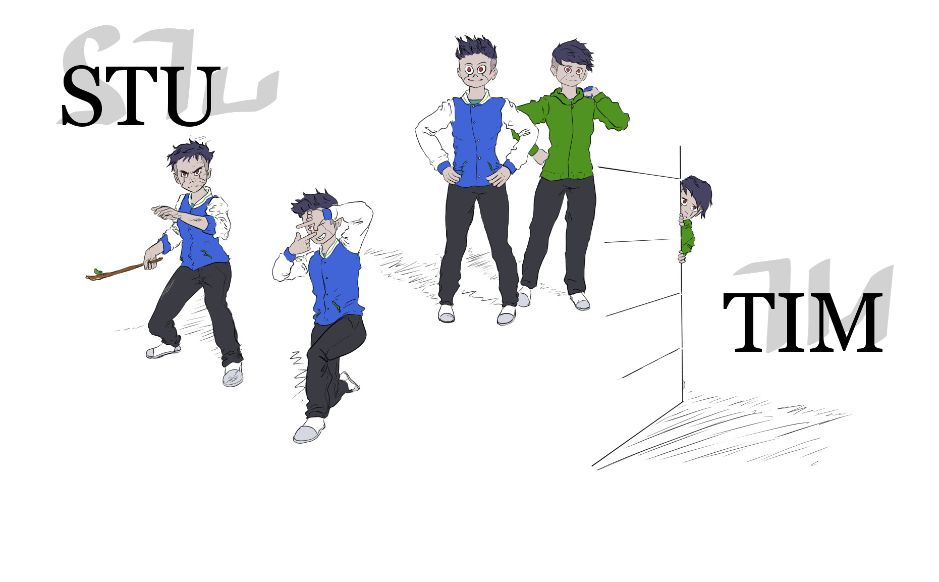
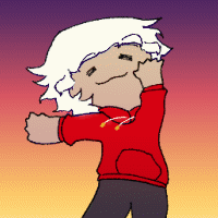
The main cast! Well, an early reference draft, at least.
In most of the Cosmic Void story, Feryuu is the main focus point, but in Genesis, she's sharing the spotlight with Amy, Kane, and the twins Stu and Tim.
I expected writing them to be a challenge, as I don't usually write children characters, but it turned out to come rather naturally in the end.
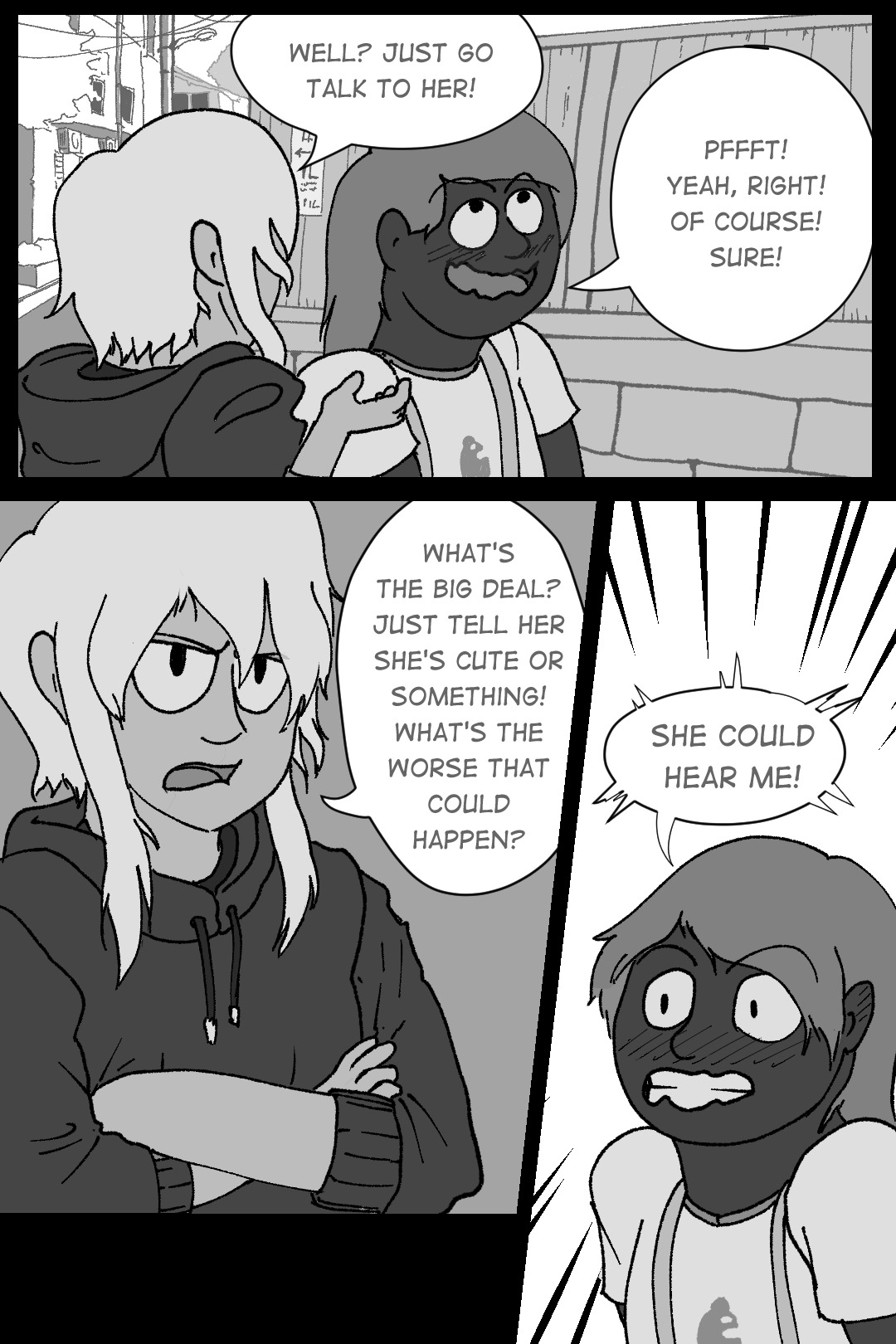
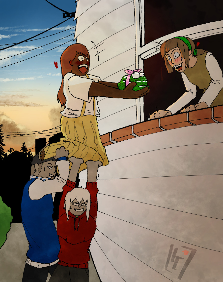
Amy is someone who is full of love, so I knew early on that she was going to have a crush on a classmate at some point. It ended up being a very fun B plot to write.
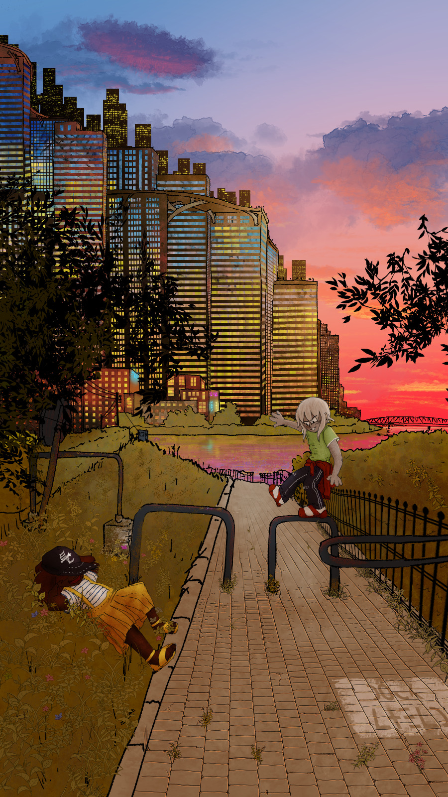
Although a lot of worldbuilding went into Cape Namida, most of the story does not happen there, but rather in the Michitat District, which is right across the channel. I wanted Michitat to feel like a coastal town, but I also wanted to have details around to remind that this is, in fact, still a dense city. Having the towering skyscrapers of Cape Namida in the background often helps with that.
★ Favorited by 52 people

Comments
No comment yet. Be the first to leave a message!