Latest post
Artfight 2025, week 1
July 8, 2025

Artfight 2025 has started and I am once again fighting for my life.
Here's the attacks I've made this week!
[Tommy looking at the viewer while standing behind a counter. Guns are on display in the back.]
[Yasem blepping at the viewer]
[Cesium looking at the bracelet on his wrist]
[Lucine defending Fiametta]
Popular posts
Attack on Touhou
Sept. 11, 2013
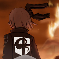
[a parody of the attack on titan promo poster. youmu standing with her back towards the viewer, and a giant wall in the distance. Marisa towers over the walls. the surroundings are on fire.]
On that day, Gensokyo received a grim reminder:
"Take it easy~!"
Artfight 2024 highlights review
Sept. 20, 2024
As you know, ArtFight was.... checks calendar ...2 months ago??? Oh how time flies...
Anyway, as is tradition, once Artfight is over and a bit of time has passed, I do a highlight roundup of my favorite pieces, along with my new thoughts on these now that they're not as fresh in my mind (though this year we're teetering on stale).
[Linkyu fishing out Tsunami out of a lake.]
First up is this one. I still like it, but for some reason, even though I rotoscoped my own models, the proportions look a bit exaggerated. Maybe it's the angle? Either way, I'm still a fan of the background, though the water would look better with some more shine to it, I think. It is rather flat, as is.
[Scooter lifting a large log.]
Yeah this one is still fantastic; even though I didn't put too much effort in the tree, I think it looks great, and the pose angle works very well in this piece. I should be more careful with the colouring, though, because I can see many missed spots in this one.
[Halley looking at the viewer.]
This one is not as technically impressive as the other ones, but I mean. Comeon. Big fluffy tiger. That's just good content, no matter what.
[Prism leaning on a motorcycle while looking at the viewer.]
Oh this one was fun. The composition works great, but I think I should have put more effort into the bike itself. It doesn't look bad, but it seems less polished than the rest of the piece in comparison. I definitely nailed the background though, several people thought it was a photograph at first.
[Tsunami singing underwater while bending backwards.]
Another popular one, and looking back at it now, yeah I can see why. It's very evocative. Some more work could have been done on the shadows, but honestly that's easily outshone (haha) by the composition here.
[BOEING taking a selfie above the clouds]
Oh wow, those clouds are even better than I remembered. No wonder this one specifically has been doing numbers on Cohost.
Well.
That's it for now I guess! Like I said last time, I am currently working on a game, now named Klondike's Hike! I'm hoping to have a playable demo in the coming weeks, sooooo
Stay tuned!
Artfight '23 highlights
July 31, 2023
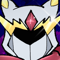
Here are some of my favourite pieces from this year's Artfight!
[A humanoid in space in an angelic pose.]
[A human in a dramatic pose, wearing a billowing cape. The cosmos can be seen in the inside of the cape.]
[An anthropomoprhic cat looking down; he is wearing military garb. The perspective is exaggerated. The moon is large is just above the character.]
[An android riding a motorcycle in a precarious way.]
[A humanoid person crouched in the forest, with large wings. The person is wearing a reflective mask. The art style in the reflection is realistic.]
[An antropomorhic rabbit floating in the air]
[A Tiefling leaning against a bar.]
[In the "oh approching me" meme pose, Linkyu is approaching Tapestry.]
Waving the flag high
June 30, 2023
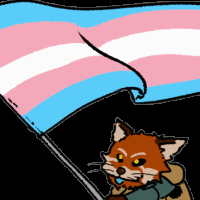
[An anthrpomorphic red panda enthusiastically waving a trans flag.]
A quick something I did for Pride Month.
Artfight 2024, week 4
July 29, 2024
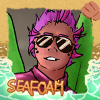
New week, new batch! Let's get right into it.
[Halley looking at the viewer.]
I only ever saw Halley drawn in a cartoony style, so I wanted to take a stab at a more realistic rendition. I think it came out pretty good!
[Osda and Moon enjoying sushis at a conveyor belt joint. The rolls are implied to be optic fiber slices.]
I've been meaning to draw the "shark bites optical fiber" meme with Osda for a while but never got around to, and Io's rendition of that meme made me want to do it even more, too!
Well, this isn't that, but it's reminiscent of that! Like a hommage or something. A nod. To the meme I never drew. Yeah.
Anyway, this piece was super painful to draw because the references I've used made me SO hungry. I had to stop and have an early lunch that day.
[Prism leaning on a motorcycle while looking at the viewer.]
This was a fun piece to work on. Prism is cool. I'm also really happy with the background, even though that was by far the quickest part of the piece to make (like 20 minutes or something).
Man, I should draw bikes more often.
[Tsunami singing underwater while bending backwards.]
As is tradition, I make sure to give Tea an attack for her birthday; this year I wanted to go for something even more dramatic than usual. I'm not 100% satisfied with this piece, but apparently people have been liking this one the most, so... neat?
[Arthur reminising about a man he has never met while having his mechanical arm serviced by Cid.]
A bit of an injoke, this one. Alright, story time.
The Viera here is Arthur, a character that Ailanthium has been using in various settings for a while. In one of the earlier settings, he was friend with a character of mine, Fereinn; it was platonically, in canon, but oh so much more in the cracks that people have written (though, well, we did encourage it, it was always funny as shit).
So imagine my delight when I read that the man behind Arthur's arm is none other than Cid nan Garland, a man who shares so so many similarities with a future version of Fereinn (which was bound to happen, as Cid Highwind was the main inspiration for him lmao).
Anyway, that's the context. I thought it was pretty funny.
[Iris piloting her mecha while streaming.]
I'm not sure what the inside of a swallowtail is supposed to look like, but since Iris uses a lot of AR stuff, I figured I'd have some fun with that.
[The Yapper yapping away.]
hmmmmm fuit gummy
[Trick spinning a dagger in the air.]
A cool elf! Initially I wanted to draw a more scenic scene, with waves crashing on the hull of a ship and all that, but I didn't have the energy to embark on that kind of journey so I went with something significantly simpler.
[Starset standing tall, looking menacing.]
I was surprised to find a night fury OC; never really crossed my mind that it would be a thing, really. Anyway, it's a dragon, so my usual trick works just fine here: just draw a wide cat. Yep that's my secret to dragons, folks. I just draw cats. Hard to unsee it once you know, really. Sorry for that.
And with this, the total number of attacks so far is 18, which ties last year's record! Ideally, I would love to make it 30, so that it fills an entire page in the attack list, but we'll see how that goes hah
Artfight 2024, week 5 [FINAL WEEK]
Aug. 8, 2024
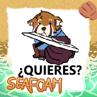
Oops this was supposed to go up during the weekend but I was actually away at the time and got busy since. Well I'm awake at 6am right now so what better time to go through these, right? It's a big batch, too!
Let's go:
[Leona whipping her swords around.]
This one was really fun to work on; I'm really happy with the swords, but I wish the upper body had more dynamism to it. The pose I used doesn't convey it enough in my opinion.
That said, it definitely was one of my most popular pieces this year!
[Deborah posing whimsically]
Such a cute creature. I decided to maximize the floof on that one, especially on the markings. Funnily enough, that's how I used to draw furries 15 years ago.
[Arthur handing out mail to the viewer.]
Arthur's setting is very similar to Cosmic Void: Genesis, so I was instantly hooked and had to draw him. Also he's a red panda so you know. Bit of bias and all.
[Dearly Beloved looking at the viewer with a glowing morning star raised and ready to strike.]
You can tell this was the last piece of the day haha, I've definitely rushed it. Still, I'm happy with some of the effects. If I had more time, I think I would have gone for a more dramatic angle.
[Candy Corn looming over the viewer. The moon shines red in the background.]
Speaking of dramatic angles, here's one that worked a lot better! I think I made it a bit too dark to see that he's holding his cape, but the contrast makes it work.
[Klove looking professional.]
It's not often you see pink dragonborns. This one even has an exotic breath weapon (lye)! How fun!
I wanted to go for a very professional look for this, and I think I got it.
[Phemus lounging on a throne.]
Another fun piece for Aseuki! As usual, the gold trims are the highlight of this. I wonder if I did make it too dark, though; on most screens it looks fine to me but my main monitor has very deep blacks so it's hard to make out the details on it...
[Mir Falspar holding a coffee cup.]
This man needs a break. I hope he can rest some more soon.
[Oliver letting out a loud "A"]
A!
A fun little piece to showcase Oliver's power! Also I kept thinking that he was a bat for a while but no he's a bnnuy..... oops
[Nini's fursona doing a little dance]
Speaking of bunny.... well no this is a dog, actually. At this rate I'm gonna have a mùy bunny lover license revoked!!!
[IVie leaning against a doorframe, waiting.]
This piece was a nice change of pace. Nothing crazy, just a simple pose on a simple background. That right hand did give me a lot of trouble though.
[BOEING taking a selfie above the clouds]
And finally, an Aeromorph for my final piece! I wanted to draw one this year and this was the cutest one I would find. I also wanted to emulate the pilot selfie thing, so this was a lot of fun.
That said, the better I get at drawing clouds, the more I worry that people might think I'm using photo backgrounds..... I can assure you that these are all painted! I love painting clouds! Blame Bob Ross!
Well anyway.
This concludes this year's Art Fight!
There will be a lot less art for a little while as I am now starting a new project; a Solitaire roguelike game! I will make a longer post about it but in the meantime, you can catch me on twitch if you want to follow along!
Alright, that's it for real now! Bye!
Genesis concept art
May 7, 2022
Some concept art for Cosmic Void: Genesis
[A view of feryuu looking up into the high-rises of Cape Namida. Bridges are connecting the buildings.]
The idea with Cape Namida is that it's a very dense city, with very little horizontal space, so it is built very vertically. Because of this, going from building to building can take a very long time if you have to go down to street-level every time, so bridges are built between the buildings to minimize the need for long elevators.
I feel like something like this would require a lot of safety nets, but that sounds like a big maintenance cost, so I'm thinking most bridges are probably enclosed, actually.
[4 illustrations. The first one is of Feryuu, holding a red NO sign while shouting from atop a playfground slide. The second one is Feryuu dangling from a rope with lasers around. Third is Feryuu swinging a bat. Last is silhouette of Feryuu from the back.]
Genesis will have 5 chapters, one for each school year. I want the first 2 to be very light-hearted, to build up the characters, then gradually make them grow through increasingly high-stakes events in the next 3 chapters.
[Feryuu in the middle of throwing a baseball pitch. The scoreboard is visible in the background. It is the final inning, with 2 strikes.]
[Feryuu batting. The sound effect CLINK is floating around her.]
When I started writing Genesis, I didn't expect baseball to even be a thing at all, and now it is a very important part of the story. It certainly didn't help that as the idea grew on me, I looked up baseball representations in other medias and ended up binging all of the Big Windup! manga. That really cemented it for me, like a "oh yeah, this is exactly what I want to add to this story" kind of way.
[Feryuu in a red baseball uniform, leaning on a bat. She looks smug.]
I had a lot of fun designing the uniform, too! I wanted something slightly modern, but with a retro aesthetic, to match the world of Genesis. In the end I used the shield design from the late 1800s, so maybe I went a bit overboard with it... But I guess it fits with some of the anachronistic details of the story, so I'll pretend this was on purpose.
[A comic panel of a convenience store. Feryuu is shouting about needing a president's signature to Maja, who is very confused.]
Ahhh, Conima. This place will come up a lot in the story, as this is the workplace for Maja's side job (she's the kids homeroom teacher during most days). Her appartment is also located just above the store. Because of the close relationship between her and the kids, they end up frequenting this store a lot.
It's a very typical franchised corner store; part of it is inspired from japanese konbinis, but really it's more of a small grocery store, like a Vidal. Well, I guess nowadays there is very little difference between the two anymore.
[Feryuu in several poses][Amy in several poses]
[Kane in several poses][Tim and Stu in several poses]
The main cast! Well, an early reference draft, at least.
In most of the Cosmic Void story, Feryuu is the main focus point, but in Genesis, she's sharing the spotlight with Amy, Kane, and the twins Stu and Tim.
I expected writing them to be a challenge, as I don't usually write children characters, but it turned out to come rather naturally in the end.
[A comic page, with Feryuu asking Amy to confess her feelings to someone.]
[Stu and Feryuu are holding Amy above their heads, so she can be at eye-level with someone at a window. She's offering a ceramic frog to the person. Both look ecstatic.]
Amy is someone who is full of love, so I knew early on that she was going to have a crush on a classmate at some point. It ended up being a very fun B plot to write.
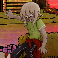
[A picture of Feryuu and Amy. Amy is lying down in the grass on the side of the path. Feryuu is balancing on metal bars. Cape Namida can be seen in the background. It is dusk.]
Although a lot of worldbuilding went into Cape Namida, most of the story does not happen there, but rather in the Michitat District, which is right across the channel. I wanted Michitat to feel like a coastal town, but I also wanted to have details around to remind that this is, in fact, still a dense city. Having the towering skyscrapers of Cape Namida in the background often helps with that.
Ochako sword sunday
Sept. 30, 2018
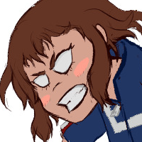
[Uraraka Ochacko with a Halo energy sword. She looks very angry.]
I'll be completely honest, I absolutely do not remember the context of this drawing.

